Welcome to the Slider Builder 🎉
Now that you've created your Slider, let's walk through all the available options for Slider customization step by step. This guide will help you tailor your Slider to fit your website perfectly.
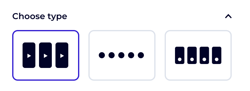
Choose Type 🎨
In this section, you can change the design of your Videobot Slider. Whether you're setting it up for the first time or testing new designs after installation, you can easily switch between options to see what works best for your site.
Content
Videobots 🎥
Here, you can choose which Videobots you want to display in your Slider. You have several options to control which Videobots appear:
- All Videobots: This option will include all the Videobots in your account in the Slider.
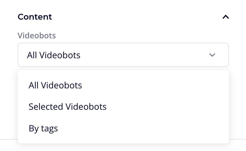
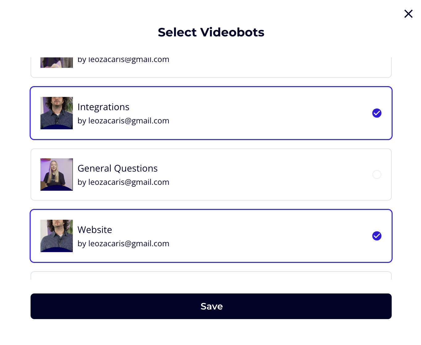
- Selected Videobots: This allows you to handpick specific Videobots from a list.
- By Tags: You can select a tag, and all Videobots with that tag will be used in the Slider.
(To tag Videobots, go to Videobot Builder → Settings → Slider Options.)
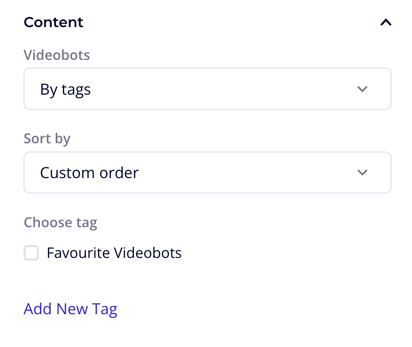
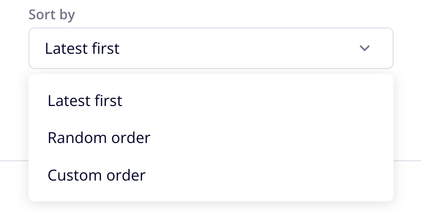
Sort By
Choose how you want to sort the Videobots within your Slider. This could be based on criteria such as most recent, alphabetical order, or custom order based on your preferences.
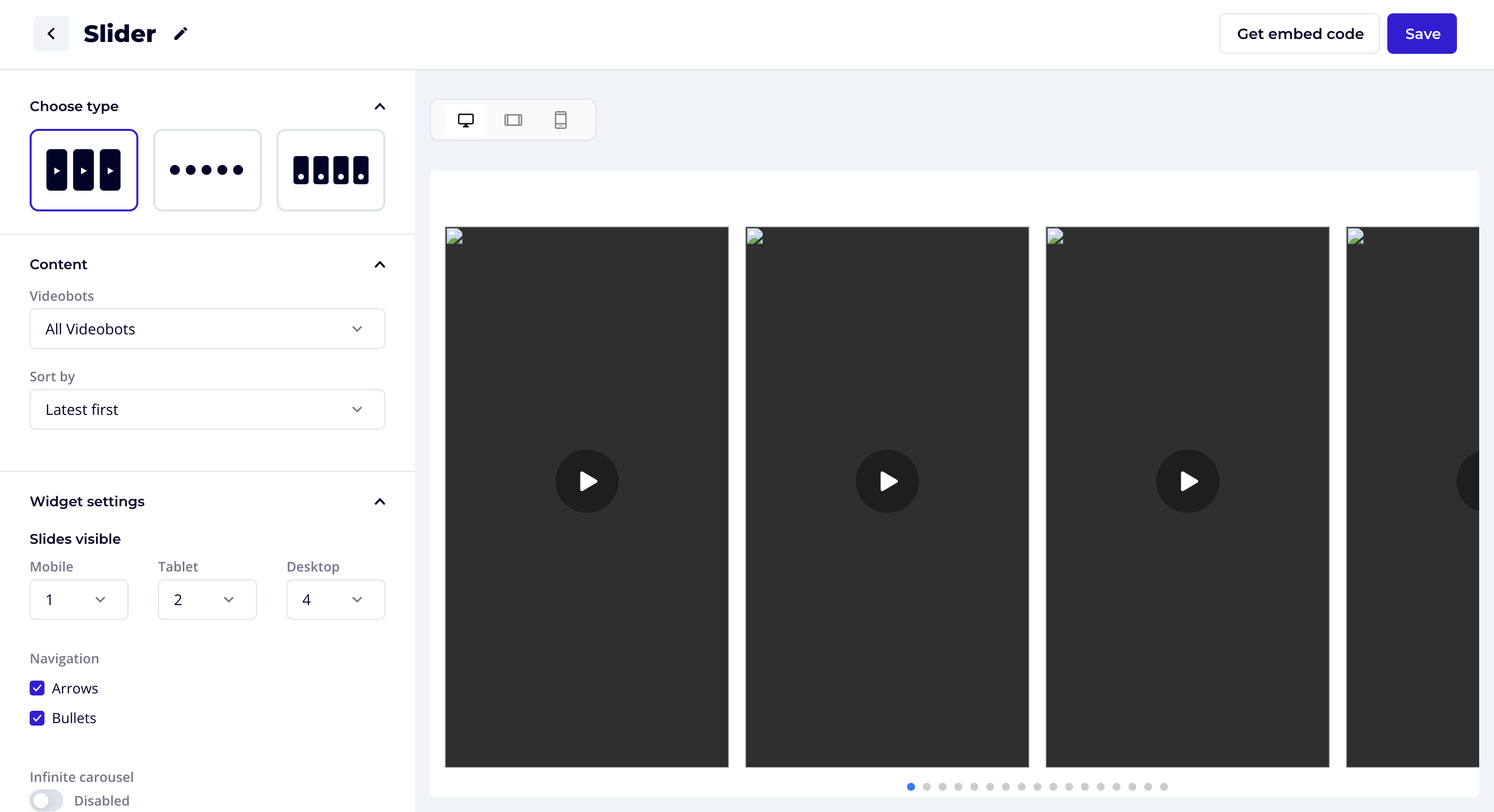
Widget Settings ⚙️
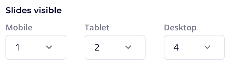
Slides Visible 📱💻
Mobile/Tablet/Desktop: Choose how many Videobots to display in the Slider UI for different devices (mobile, tablet, or desktop). This allows you to control the number of visible slides based on screen size.
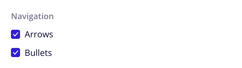
Navigation
- Arrows: Enable arrow buttons that appear in the top right corner, allowing users to scroll through the Slider if there are more Videobots than visible in the UI.
- Bullets: Enable round points at the bottom of the Slider, indicating if more Videobots are available to scroll through.
Infinite Carousel 🔄
Enable Infinite Carousel if you want users to continuously scroll through the Videobot Slider without reaching a stop. If disabled, the Slider will have a first and last Videobot, preventing users from scrolling backward from the first or forward from the last slide.

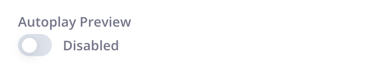
Autoplay Preview 🎥
Enable this option to show a video preview in the UI of the Slider. If disabled, the videos will remain still within the UI until interacted with.
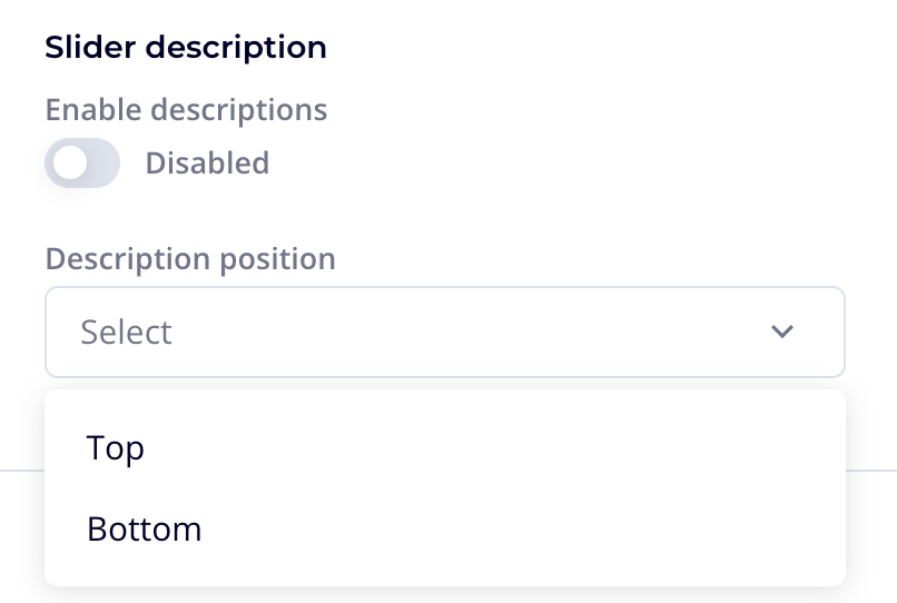
Enable Story Descriptions 📝
For stories, enable this setting if you want a label to appear beneath each circle. You can edit the description in the Videobot Builder → Settings → Slider Options → Story Description. If the custom description field is left empty but labels are activated in the slider settings, the name of the Videobot will be used by default.
Advanced
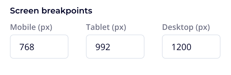
Screen Breakpoints 📐
Mobile/Tablet/Desktop (px): Customize the breakpoints for mobile, tablet, and desktop layouts. This allows you to precisely adjust the responsive settings to match your website’s breakpoints or to suit your specific design preferences.
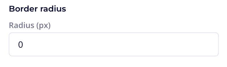
Border Radius 🔳
Radius (px): Adjust the roundness of the corners for the Slider and Cards. Increase the radius for more rounded corners, or decrease for sharper edges.
Custom CSS
You can overwrite styles in the Videobot Slider by applying your own CSS customizations. Below are a few examples of common customizations. For more options or assistance, feel free to contact [email protected].
Changing the Slider's Roundness/Border Radius
To adjust the border radius of the slider, you can use the following CSS:
.widget-slider__card {
  border-top-left-radius: 10px;  /* Adjust size as needed */
  border-top-right-radius: 10px;  /* Adjust size as needed */
}
Changing Player’s Backdrop Color
To adjust the backdrop color of the player, you can use the following CSS:
.videobot-widget .widget-player__backdrop {
  background-color: white;
}
Changing Slider's Description font and size
@font-face {
  font-family: 'Custom Font';
  src: url('http://...');
}

.videobot-widget .widget-slider .widget-slider__card__description {
  font-family: 'Custom Font', sans-serif;
  font-weight: 800;
  font-size: 1rem;
}
Changing Stories' Description font and size
@font-face {
  font-family: 'Custom Font';
  src: url('http://...');
}

.videobot-widget .widget-thumbnails .widget-thumbnails__thumbnail {
  font-family: 'Custom Font', sans-serif;
  font-weight: 800;
  font-size: 1rem;
}
Changing Cards' Description font and size
@font-face {
  font-family: 'Custom Font';
  src: url('http://...');
}

.videobot-widget .widget-card .widget-card__card__description {
  font-family: 'Custom Font', sans-serif;
  font-weight: 800;
  font-size: 1rem;
}