Accessibility
For WCAG Level A and AA (and AAA) compliance, you must preserve contrast rules when choosing custom colors. Contrast ensures text and interactive elements are readable and distinguishable for users with low vision or color deficiency. Videobot uses your main theme colors from Account Settings → Main Theme Colours, or you can overwrite global colours in Videobot settings.
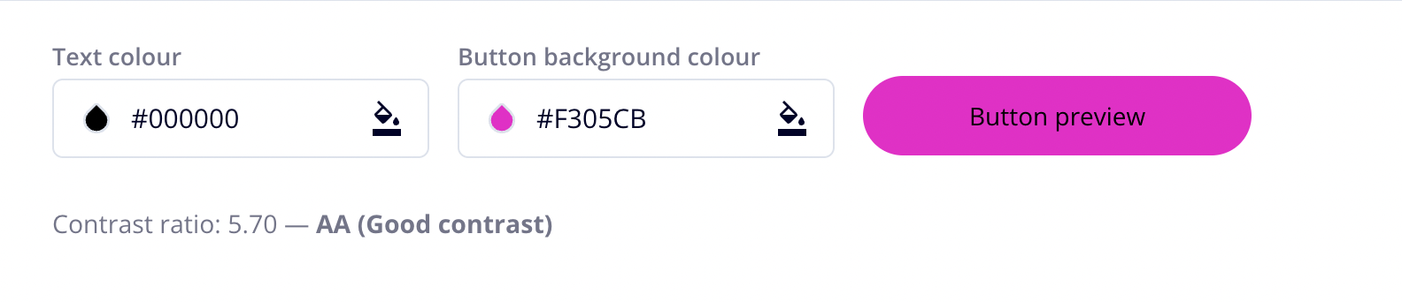
Use custom colours for your Videobot by selecting colors in the theme or Videobot settings and verifying the contrast ratio meets WCAG guidelines:
- Text and icons: at least 4.5:1 (AA) or 7:1 (AAA).
- UI components and graphical objects: at least 3:1 for Level AA.
The contrast checker is built in, and will help you make sure the colors you selected won't interfere with accessibility.
Why Contrast Matters
Good contrast helps:
- Users with low vision distinguish interface elements.
- Color-blind users perceive differences in controls.
- Everyone read content in various lighting conditions.
Focus Styles
By default, the focus outline is white, which may not have enough contrast against some backgrounds.
If the currentColor outline doesn’t provide enough contrast with the button’s background, override it with a custom color. First, check the contrast in our color picker, then add custom CSS like:
.options-wrapper button:focus,
.options-wrapper a:focus {
  outline: 2px solid /* your chosen color */;
}